Wednesday 15 December 2010

Esther Walker : A bit of context

When deciding what route to go down with the branding for Esther there were a few things that really caught my eye. 


1.

 2.

 3.

 4.
 5.

6.


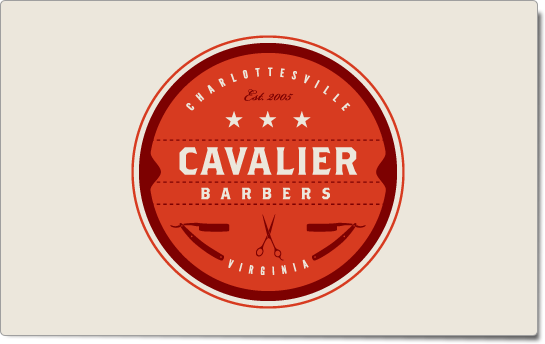
In genreal I have been seeing a lot of these retro styled pieces of design, more specifically within branding. There are some really nice pieces around, here are a few of my favourites.

1) With almost all of these designs there is a similar pattern, the shapes and motifs used are all quite similar. The type is nice on this, it's quite a simple logo with simple elements but put together it makes something that gives a distinct impression of being several decades old. (Apart from the web address obviously). Unknown designer.

2) Again, the same as above really. The shape is quite similar to the above, circular. But it's what goes on inside the circle that makes it interesting. More specifically the immediate shape inside of the circle.(By Taste of Ink).

3) This is my favourite, and probably the one piece that has led me into the design direction I am following. It's so basic, but it's so good. It's for an ice cream bar, there is no image to show this but somehow it still looks perfect for it. Unknown designer.

4, 5 & 6 ) All quite similar in terms of form and style. Again, the overall effect of the visual is the same. This is exactly the same sort of kitsch, retro feel I want to give Esther's brand.


Thomas Howes Web design

I struggled to do much development for Tom's website (apart from layout grids and masses of coding and organising files) because he knew exacctly what he wanted and I agreed, I did show him some examples of the sort of site I could create for him but he politley declined. Instead he showed me some examples of websites he likes.


One big similarity is the cleanliness of each site, they are easy to navigate, organised and easy to view images. 

1) French - http://www.tapedcopies.com/work.html
2) Kill Pixie - http://www.killpixie.net/home.html
3) Olly Moss - http://www.ollymoss.com/

Tom Howes Branding - Stationary ideas

There are some brilliantly designed identities around at the minute. It's noticing these over the summer that made me want to give it a go for myself. Although I love image making I really like some of the type/layout as well as the colour and composition on these examples;


 1)

2)

3)

 4)


5)

- - - - - - - - - - - - - - - - - - - - - - - - - - - - - - - - - - - - - - - - - - - - - - -

1&2) Identity for J.W. Hall builders by Abby Brewster. The mixture of typefaces is something I really like and want to try out myself. I love the two patterns used in the stationary, they're quite different but work as a whole and tie the identity together. It would have been nice to see the envelope pattern used on the back of the business card (the one with solid black) but apart from that this is a really nice set, it looks quite luxurious for just a two colour identity but the little detailing makes it that little bit more special.

3) It was this folded business card by Dan Cassaro (or maybe a little book cover/card wallet, I'm not sure) that gave me the idea to make Tom's branding a bit more eyecatching by using a block pattern. As I mentioned above, the bit of detailing a pattern can bring something to life.

4) 'The Great Gatsby Business Card Print
Chapter four of F. Scott Fitzgerald's The Great Gatsby reads like a VIP guest list of the Jazz Age. Taking inspiration from those pages, this poster is comprised of the business cards and personal stationery of the movers and shakers that attended Gatsby's parties in the summer of 1922.'


The trend for making something new look old always appeals to me (Nostalgia in design is my dissertation subject) so I was drawn to this, especially the array of nice type. Without even knowing who each business card is designed for you get a good sense of character just through the colour, composition and typeface used. This communication through visuals is important especially in branding and identities as it can be the first impression a customer or potential employer will get.


5) I love this because it's ultra modern, ultra slick, bold and attractive. All this when essentially it's a very basic composition of shape and type as well as being in black and white. I knew for my design my budget would be tight and I was starting to worry about pulling it off on low funds but this proves good design doesn't have to cost the earth. Branding for Stack architects by The Consult

Wednesday 20 October 2010


book design: solving a problem


I've been worrying a bit about how my book fair books will turn out because I'm so skint. Especially because I wanted to make about fifteen of them I knew it would be pricey but I calculated the cost of printed and hard binding each book (A4 square format) and IT IS EXPENSIVE. Too expensive. So, in the quest to make something cheap(er) but still lovely there were few solutions that I liked until I saw this. Who thought rubber bands could look so lovely? 
I'm definatley going to be 'binding' my books like this - I might look into buying some coloured bands to make them a bit more special, but I like how they are then just like big postcards. Good idea or not? 


I have no idea who did this, so if anyone does let me know! I love it. I think I mentioned the astonishing volume of amazing wedding invites I've seen recently, this one goes into that category. And it uses one of my favourite typefaces (adelle basic- right at the bottom). Nice nice.


Now then, these are just lovely. A bit twee for my taste, but overall theres a nice mix between hand made and professional finishes. I love the 'fennel pollen' speech bubble shaped bit, that could almost be there on it's own without the surrounding bits, just some nice simple type to tie in all the essential info. Still cute though.

Tuesday 5 October 2010

Cats, dogs (and other animals)


Tom Edwards. I saw his illustrations a while ago and whilst browing through his flickr recently I saw his lovely animal illustrations. The cat, specifically is sort of what my cat and dog illustrations are looking a bit like at the minute. My illustrations will have the same kind of whimsical, colourful, free hand sort of look to them. I'm going to be drawing mainly with watercolour pencils and coloured chalk. I have a tendancy of worrying when I draw that they will come out too erm...child like. I enjoy drawing for myself, I don't show people these drawings because they are so...abstract? I suppose. Anyway, my point is that although these drawings bear a  similarity in my own personal drawings (media, textures, subjects etc) Tom Edward's is really very popular, and people seem to enjoy what he does. I'm rambling a bit now, I will come back to this post and make sure it makes more sense.


Kim Ga Young's rabbit is so lovely! I saw this ages ago and although I'm not too fond of the rest of her work this is a lovely technique or illustrating animals. I know some of my animals will be quite colourful so when I saw this again I thought it fitted in quite well with the style of illustration I am producing. It's also a very cute rabbit.
Verity Keniger has quite a varied style which is refreshing for someone like me to see. I like her tigeress and the colour and texture she has put into it. Colour and texture are two fairly important things in my cat and dog drawings so it's good to see how different illustrators use these two different things. Very good.