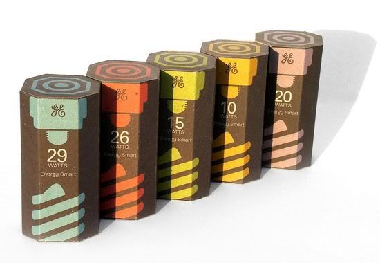
General electric CFL light bulb packaging was created by student Kevin Kwok. They are made from post-consumer cardboard in place of shell plastic. Found at thedieline.com
"The redesign of General Electric CFL light bulbs is aimed to bring a friendlier shelf presence through the use of basic informative graphics. An advantage of the redesign is the ability to stack the packages together to complete the graphical form of a CFL light bulb. The top and bottom of each package might look familiar, they graphically resemble what the top and bottom of a CFL light bulb. Also something to note is each wattage has it's own color identity.
The redesign also considered the environment, the new design is packaged with post consumer cardboard rather than calm shell plastic. This ensures the use of less natural resources and therefore less impact on the environment. GE would also allow consumers to put old CFL light bulbs back in these packages and mail them back to be recycled."
Note:
Unusual shaped packet
Type and image
Colour co-ordinated
Environmentally sound
Minimal colour pallet
DESIGN FOR PRINT: PACKAGING: FOOD & DRINK

Pearlfisher came up with these designs for the Jamie Oliver food range. The design is minimal, hand-made but effective. It reflect's the Jamie Oliver's slapdash and rustic approach to cooking. What makes the print aspect interesting is the different methods and themes that run across the range.
Some products have a rough, organic, black and white type only based package. Where others in the same range are entirely image and colour.

The colour pallet is kept to a few colours, apart from products which have black and white packets. The range is undoubtedly split down the side, by colour and non-colour. The non-colour type based products look the most 'natural'. The home-made style woodblock numbers, choosing to display weight in oz not lb or g and the chalk-board typeface makes that side of the range look so un-pretentious. It's still manages to grab attention from the shop shelf without having to use crude and over the top attention-grabbing mechanisms.
DESIGN FOR PRINT: PACKAGING: HEALTH & BEAUTY
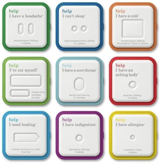
Help remedies are remedies for all ailments, which are packaged in moulded paper pulp and bio plastic. They are 100% compostable. The simple shapes and colour schemes with un complicated type and clear instruction make these packages user and enviromentally friendly.
Structure design by Appsmania and design by Little Fury.
Note:
Small scale
limited colour pallet
type only
bio degradable material
unconventional shape
DESIGN FOR PRINT: PACKAGING: HEALTH & BEAUTY

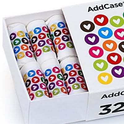
Addcase are a swedish design comapny who work with making bags from bio-degradable plastic.
This is the newest addition to their line, nappy bags.
Note:
Large colour pallet
Simple stock
Envirnomentally friendly
Size
This is the newest addition to their line, nappy bags.
Note:
Large colour pallet
Simple stock
Envirnomentally friendly
Size

Thank you for the kind words.
ReplyDelete